Hello folks,
We've been busy! While the game is still a ways out, I'm very happy with our progress. I'm putting a variety of updates upfront, and then I'll move on to something more visually appealing :)
- Phillip and I have done a ton of work on the rules and they are looking GREAT. I am going to schedule a blind playtest soon so I can see how new players react to them (this will be the first of several sessions). I performed testing a while ago before sending the rules to reviewers, so luckily we have a good baseline, but we've added many small things so I'll be sure to keep my ears open and eyes peeled. I'll also test with experienced players so we can see how variants go over.
I also hope to update our pnp with new assets so I can send everything out for broader blind playtesting, since I know many backers were interested in that. It's just not as simple as sending the new rules out since they refer to new game pieces (apothecary stations, separate extra action token, decree tokens, etc.).
- The gem molds are established, and they are going to be really cool. This took a lot of back and forth with the manufacturer, but I'm happy with where they ended up! More about this in the next update.
- I am discussing reward surveys with our pledge manager CrowdOx. They have the necessary tier and shipping details and have put together initial survey versions for my review, so we'll start to polish them up.
New Box Art
Since the campaign started, we've been listening to your feedback and talking about the box art. The art took a while for Eduardo to put together, and it's certainly a neat piece. However, after much discussion, we decided the box art does not reflect the quality of the rest of the art in the game. In addition, it's not dynamic enough - it just doesn't do a great job of drawing the viewer's eye in. This is due to a lack of action and depth. For a game about magic powers and potion brewing, ours does a weak job of featuring those prominently.
At a high level, game box art has to be stunning so it pops off store shelves (in-person and online)! So, we talked to Eduardo about going back to the (literal) drawing board.
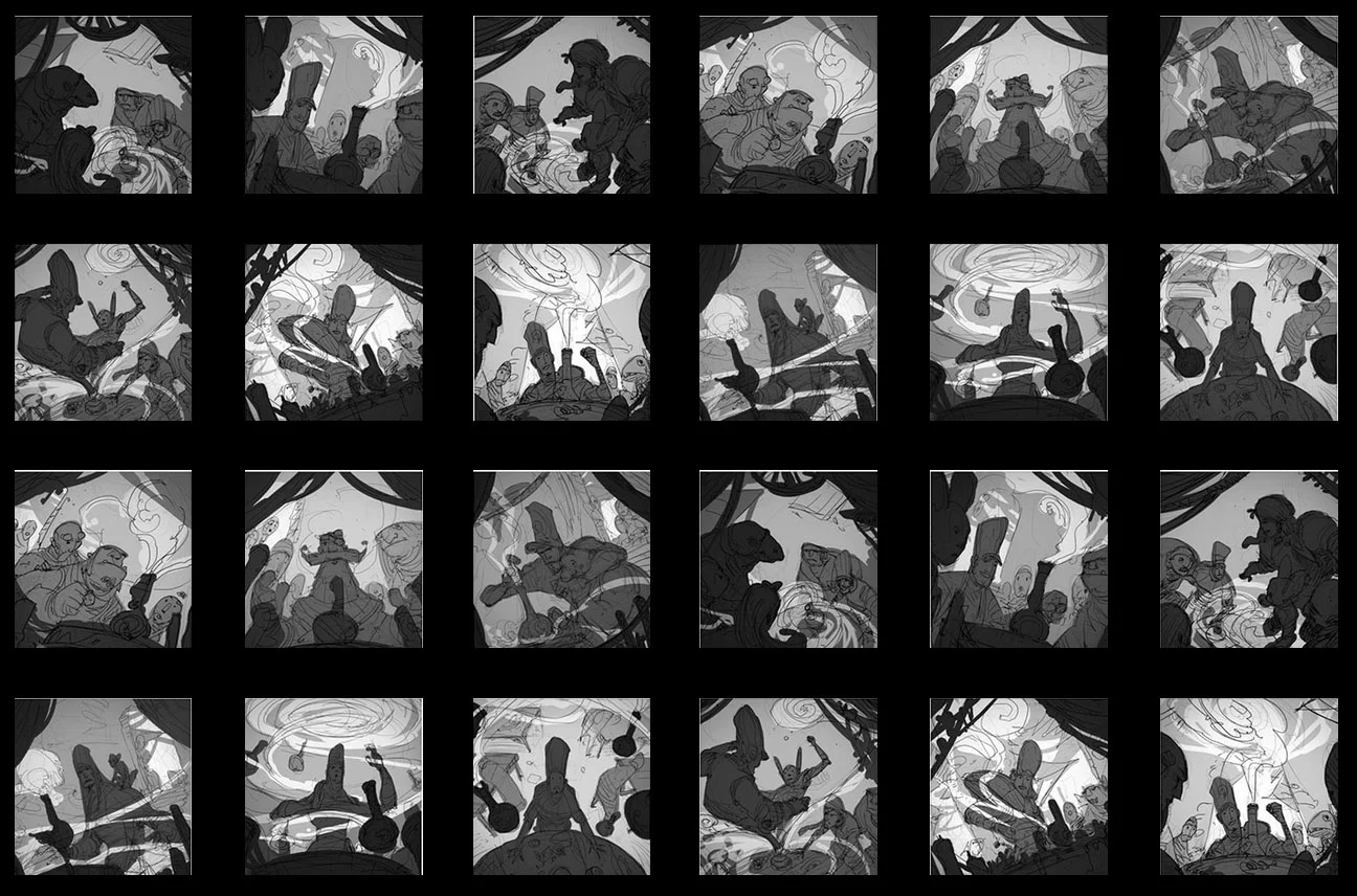
Below are a bunch of sketches Eduardo did for a new box cover:
After much discussion and some additional sketches, we whittled it down to a mix of these two pieces:
It was not an easy decision to make! When all was said and done, the sketches above kept drawing me in with their dynamic composition, prominent use of magic, and mysterious story. Also, they're just plain fun! And not only do they draw your eye in, they hold your attention as well.
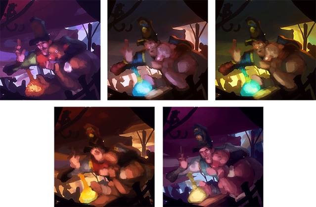
Next, Eduardo did some color tests to get a feel for the mood:
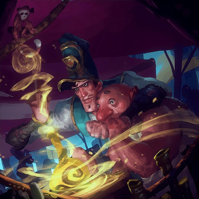
I was particularly drawn to the bottom right color palette. It captures the warm yet unique feel of the world. Eduardo proceeded to a much more detailed version:
After lots of back and forth between us, below is the version we have today, paired with Phillip's graphic design touches. The cover is still subject to change, but I am super happy with it. I think Eduardo crushed it!
Phillip has been working on the box as well, making many adjustments - it's really coming along. Here's a recent render he put together (also subject to change):
All in all, I think the box is looking great! There are still small adjustments to be made in different places, but it's certainly getting there.
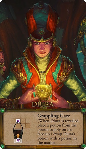
So what will happen to our friend Diura from the original box cover? Have no fear, she lives on... as the Kickstarter exclusive apothecary!
Since Diura is a Kickstarter exclusive, she gets a special treatment - a gold border around her power AND sweet, green emeralds in the corners. (Limited Edition apothecaries will likely receive the gold border, but no gems.) I think she looks great on there. Since the card is cropped to her specifically, she is much more in focus than on the box cover, and her potion has become more prominent. On a side note, playtesters really like her power - it's different from everything else in the game since she kind of has her own "zone".
Welp, I think that's plenty for now!


