This is a guest post by Mark Major, graphic designer and co-developer of Knee Jerk. Knee Jerk is now on Kickstarter, and is nearly 200% funded. Take it away, Mark!
The Knee Jerk cards started out kind of raw.
The game has three different contexts that prompt players to give their responses. There are “feelings,” “locations,” and “verbs.” Originally, the game split these each into their own deck.
Both Andy and I agreed the little bits of art in the middle of the cards could never be consistently relevant to both sides of the card, and didn’t really enhance the gameplay. This design also had a problem where non-host players would forget which term was being used, and when rereading the cards they would sometimes read the wrong term. We tried splitting it up with shapes and contrast instead.
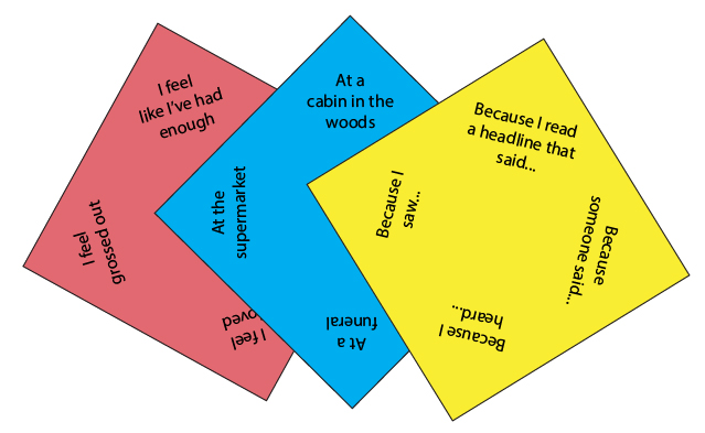
This helped with remembering which side the current situation was on. However, it also split the terms so that one side would never really mix with the other side (an entire game would be light terms or dark terms only). This went in the opposite direction of what we wanted, which was to make as many combinations as possible. To that end, we decided to try square cards in hopes of being able to fit more terms on any given card. We didn’t know if we should put terms on the sides or corners, so we tried both.


Ultimately, since there was limited space, cards would have to be too big to keep terms from cramping each other. We decided to explore round cards, since we could get away with putting just three terms on each card. This is where we first got the idea to try mixing the types of terms together on the same card. Not only did it give us more space-per-term on each card, but all cards could come from a single deck, reducing gameplay maintenance.
With that idea in mind, we went back to poker size cards, which are far more cost effective. It also let us create a way of connecting them unambiguously.
We had a layout that gave us a vast number of different combinations, and from here it was just a matter of developing the layout into the look and feel we have now.
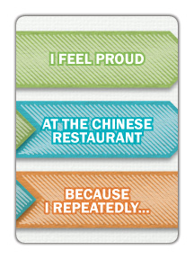
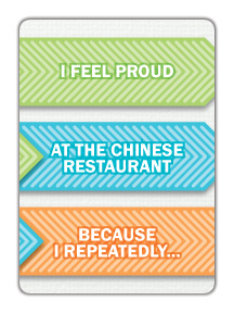
As we were exploring visual styles, there were two different looks we couldn’t quite decide between: “paper & scribble” vs. “shiny.” So, we developed both a little bit more. We liked the “thrown together” look because it had a fun feeling, but we also liked the cleaner, shinier style because a lot of other games in the same market space seemed to be having success with that direction. We also liked the perceived value that the polished art style added to the game.
We ultimately decided to push towards the cobbled-together direction, because we thought it reflected the quick, ad lib feel of the game better. We eventually added a star in the upper-left corner of each card to give players a cue for where to start reading each time.
So that’s how the look of Knee Jerk evolved to the fun, quirky, arrow-filled cards you see today. Remember: graphic design is important not just to how a game looks, but how it plays as well!


